The guidelines are as follows:
. Create a logo for a Dublin city centre gym.
. The gym's clientèle are busy, health conscious young professionals.
. The age group being targeted is 20-35.
. Put a particular emphasis on people who wouldn't consider themselves as typical gym goers who might be intimidated by the idea of it.
. The gym should be seen as friendly, accessible and helpful.
I set out to designing the logo making a few sketches and notes while following the few guidelines I made. I used Illustrator for creating the logo. I thought of using Photoshop but I felt it would be simpler to just use Illustrator. I wanted to create something that was visually appealing and strong that could be used on any type of advertising material.
I came up with the gym name "U-Fit". I felt it was strong and could be expanded onto and it would also allow me some creativity when designing a logo. The "U" stands for "Universal" but I opted to leave that out from the logo when designing it.
Here are the designs I came up with.
With this logo I wanted to incorporate something visual into the name. I went with a character who was stretching and the idea behind it was that the stretching character was making the shape of a U. I decided to add the line "Fitness & Relaxation Studio" to the logo as a way of softening the overall logo. That way, anyone who is intimidated by a gym will see that it's not all about working out and sweating.
I chose a strong font for the name of the gym and a more slim, easily readable font for the line of text under the logo. As far as the colour scheme goes, I wanted to try out just two colours on each logo. The reason for this was I didn't want to clutter up the logo's with a lot of colours or shading.
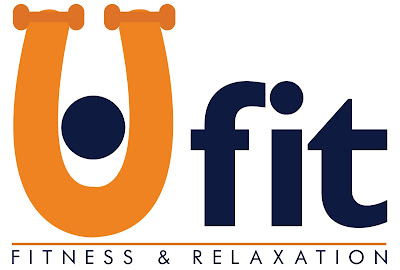
The second logo follows suit from the first in many respects. The colour scheme is the same and the layout is similar. I again went with a visual aid in the logo. I created the U free hand with a minimalist style so that it looked just like a U but if you look closer the U is a a character working out/stretching to the shape of a U. This logo was my favourite of the 3 I designed. I felt it was elegant and strong.
This is the third and final logo I designed. I enjoyed creating this logo as I felt it could be used with or without the line's of text I had used to accompany the circular design. The colour schemes in all 3 stayed the same but I used different fonts in each logo that I felt complimented the logo designs.
Out of the 3 logo's, I liked different things in each but ultimately I preferred the 2nd logo I designed so I decided to choose that as my final design. I then decided to make a few changes to the colour scheme of the 2nd logo and also keep to keep the weights in the U to further add to the illustration.
Overall, I'm happy with the outcome of this personal brief. Thank you for reading.


your right i am fit
ReplyDelete